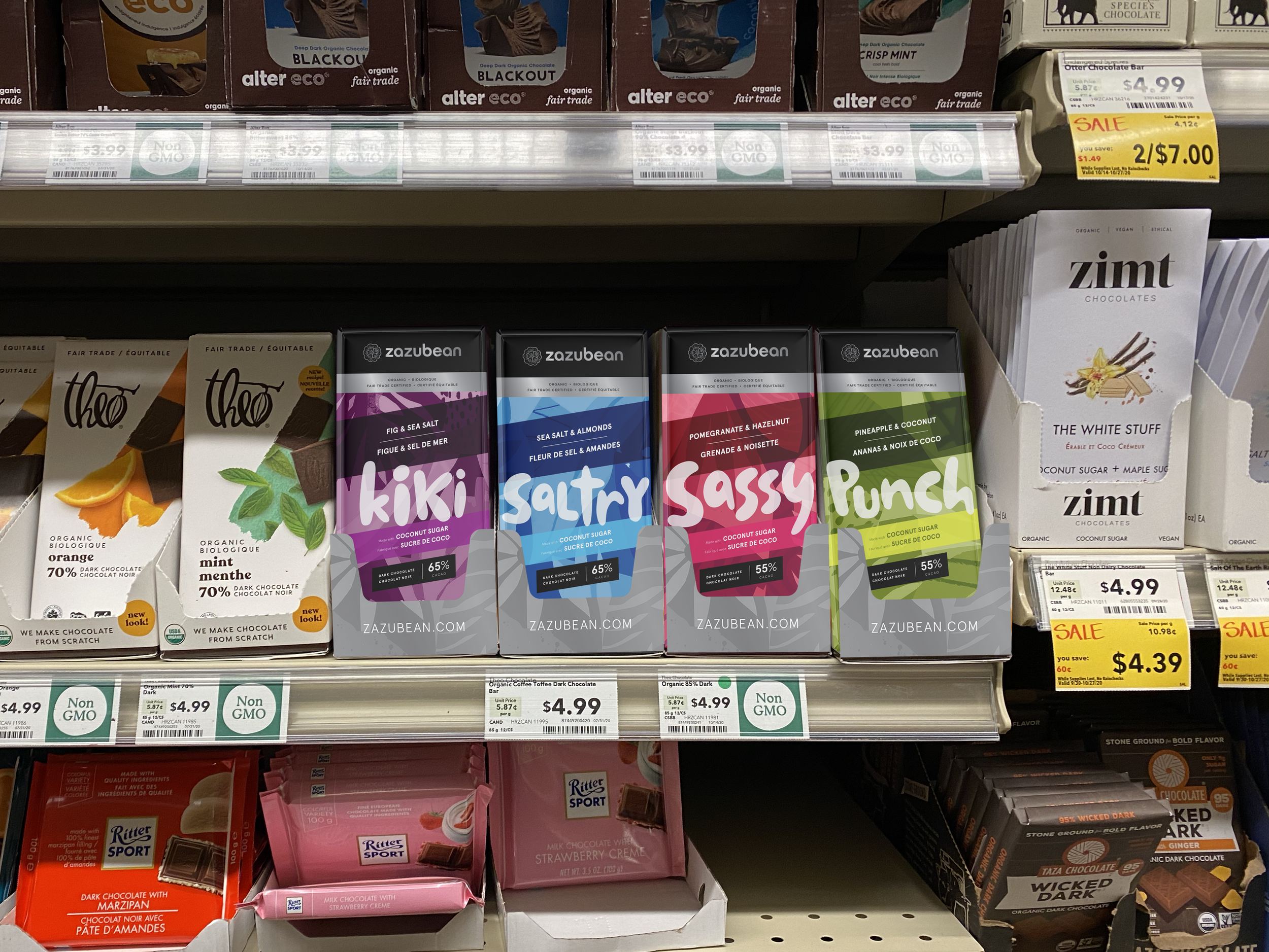
Zazubean
Zazubean Chocolate’s packaging had become harder to navigate after years of iterative changes, with a confusing hierarchy, weaker shelf presence and a dated look that competitors were starting to overtake. The goal was to evolve the brand rather than replace it, keeping its dynamic, quirky and bold personality intact.
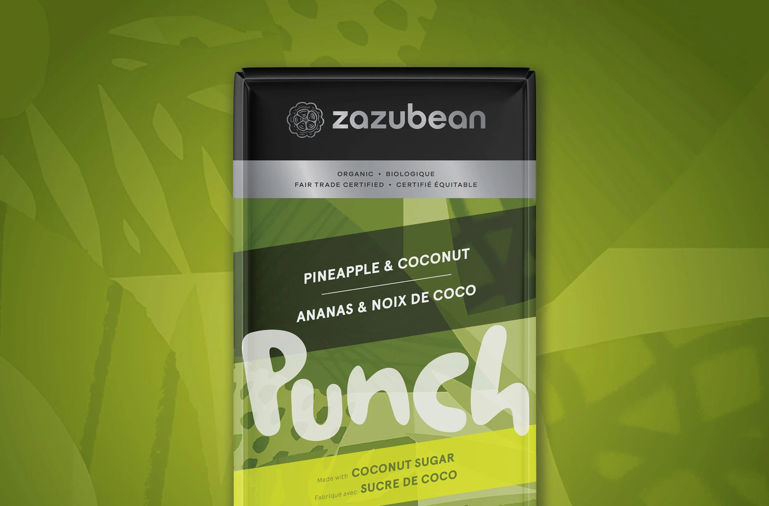
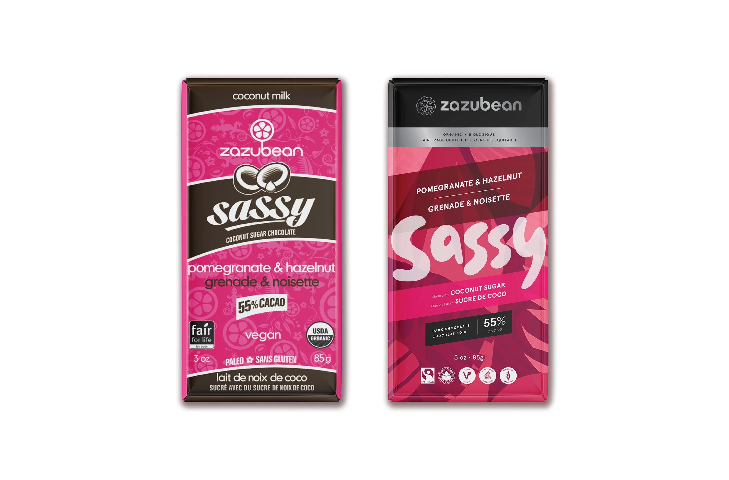
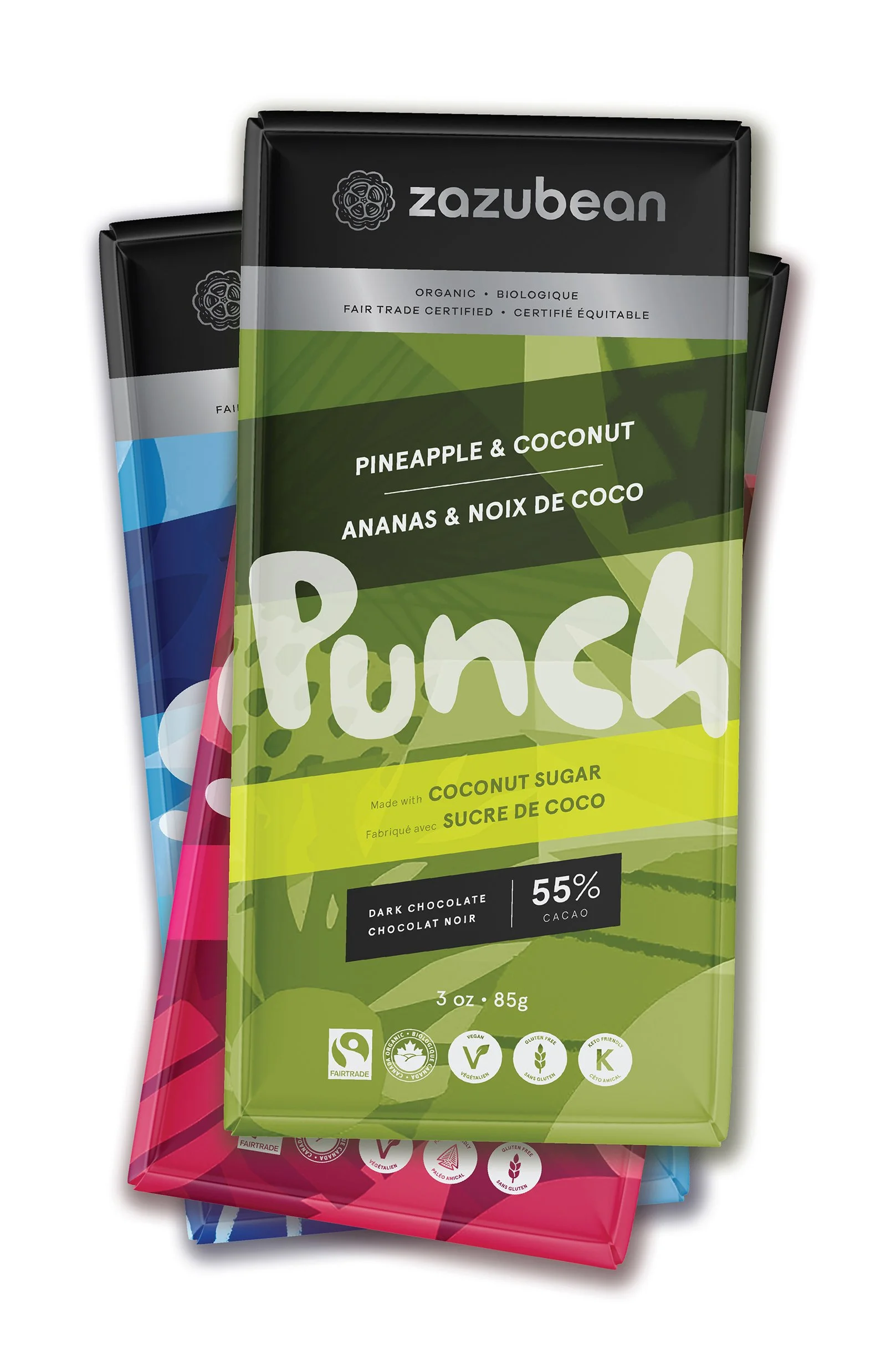
Expressive illustrations became the foundation for a renewed sense of energy, while simpler angles replaced the old swooshes and curves. The result gives the range more sophistication and a more premium feel, without losing its sense of fun. A clearer on-pack hierarchy also gives the Zazubean brand far greater presence. This work was developed for the client as part of a real brand exploration, but was ultimately not implemented; shown here for the strength of the creative approach.