Dan O’Leary

The branding of death

Branding, Design, Society

No Comments


Share this post

Funeral


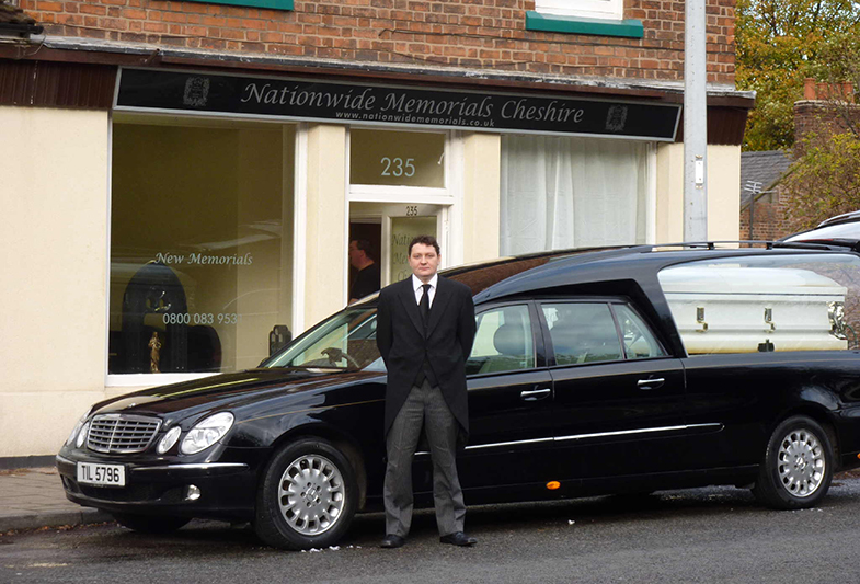
Sadly, most of us have had some kind of contact with a funeral service (also known as funeral directors in the UK). Whether you’re there to deal with the funeral arrangements after the death of a loved-one or you’re there as part of the cortége on the big day, you’ve experienced that chapel-like, flower-filled, cliché-ridden space that we’ve all come to expect. As I’ve recently been thinking about potential new business opportunities, it occurred to me that the funeral home cliché is in a self-perpetuating cycle. Why is the funeral industry treated differently? In terms of designing the consumer experience, why is it 30 years behind the rest of the retail landscape?

Let’s make it easier and suspend the notion that it’s a taboo subject; it really is a retail industry, though probably more comparable to the wedding industry. Despite that one being just as full of clichés, at least there is an attempt to lure the style or design-conscious consumer by a small number of venues, photographers and suppliers. It’s a notoriously closed industry, impossible to get into and fiercely protected by long-established, family-owned firms (or larger companies who’ve swallowed them up). In a retail sector where there is so little choice and competition, the impetus isn’t there for such an evolution. Consumers won’t drive change; because they expect exactly what they see when they walk through the door of the funeral director’s office, no one wants to try.

It seems like the perfect time for someone to offer a real alternative from the ground-up (pun intended). A branded experience, with every moment in the consumer journey fully considered, including the architecture and interior design. No white doves; contemporary interiors; a redesigned range of caskets. When the inevitable happens, we all fall into the old clichés not because “it’s what they would’ve wanted”, but because “there isn’t any alternative to the dull Victorian-style funerals on offer”. On top of that, funerals are an expensive business. It’s amazing that in this retail age, people will pay that much money for such little choice. It’ll take a funeral director with real vision to make the leap and truly rethink the experience with some best practice retail thinking. Not everything has to change for the sake of change, but death is depressing enough as it is. People don’t know what they want until you show it to them; if you really want to give people a ‘dignified departure’, at least make sure it looks good.
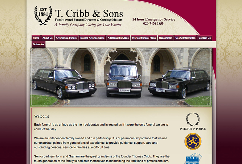
 

Cribbs

Read more

Watch the Birdie

Branding, Design, Food, Illustration

No Comments


Share this post

20140509-092736.jpg


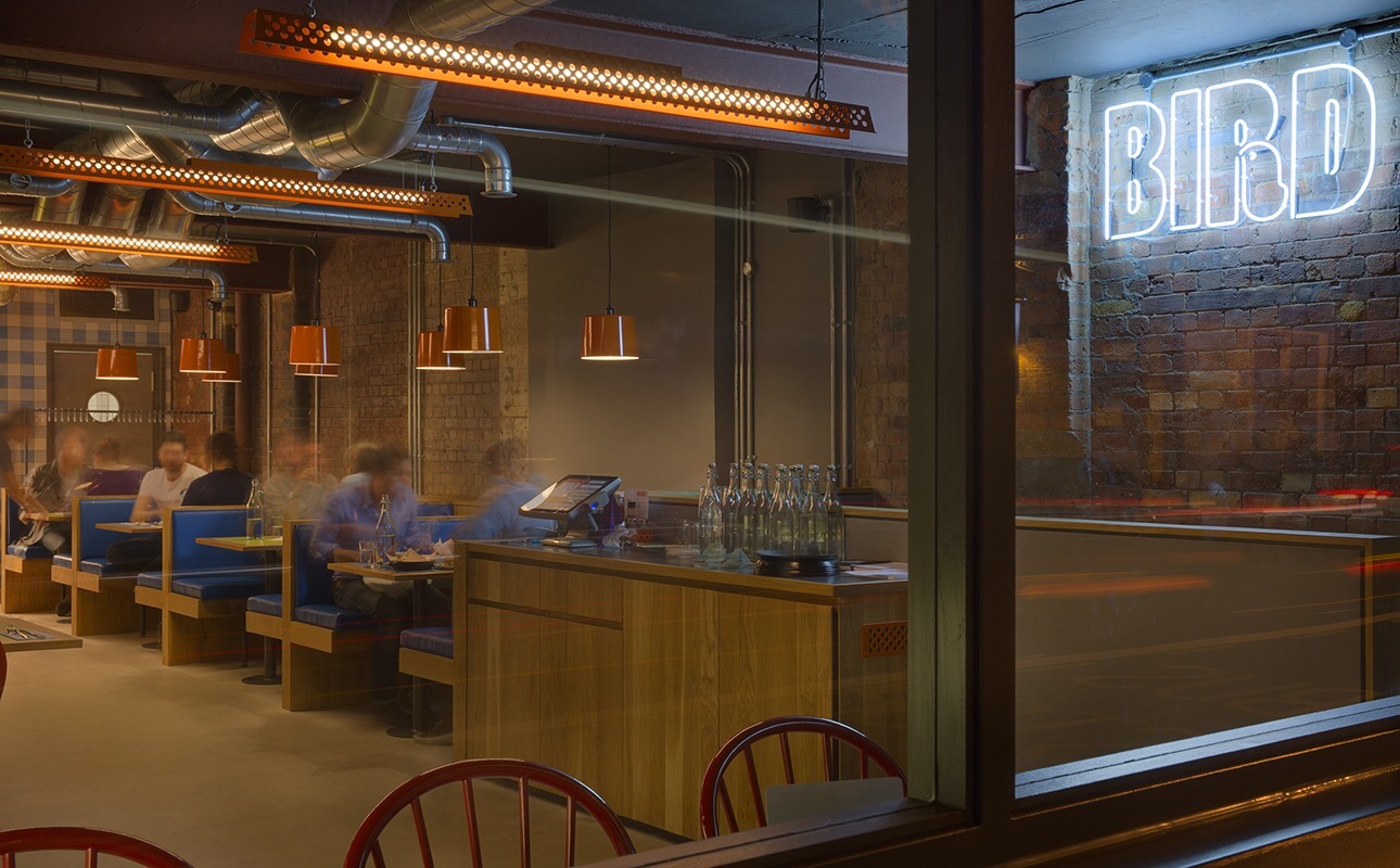
Bird is a new fried chicken restaurant that recently opened in London’s east end, and aims to elevate the food from its cheap, greasy and unhealthy image and give it a British twist; proposing yet another version of American-diner-pastiche wasn’t an option. The branding is cute, fun and original, and the rotating roster of illustrators for wall art is a really nice idea.


Read more

Cabin porn

Architecture, Design

No Comments


Share this post

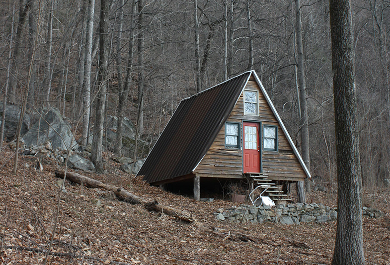
I’m not sure if it’s too odd to promote another blog on a blog, but I won’t make a habit of it. And anyway, this is a Tumblr, so I’m making an exception. Cabin Porn is possibly one of my favourite discoveries from this year. Granted, it’s another Tumblr full of pictures, but for someone like me who harbours a far-off dream of building (or buying?) a cabin in the woods, this is inspiration and fuel for keeping that dream alive. Along with old books from the 1950s and 60s on self-building your very own cabin retreat, I could look at this for hours.

Read more

Vertical farming in Vancouver

Architecture, Society

No Comments


Share this post

I was very interested to see the launch this week of an innovative use of neglected urban space; Local Garden is based on the top two levels of an under-used parkade in the middle of downtown Vancouver.

From their website—

Imagine if you could take an empty warehouse, a vacant lot, or an underused parking garage and in a 6,000 square foot area, sustainably produce as much food as a 5 acre farm. In any climate, using 92% less water than conventional field agriculture and no chemical pesticides. Now imagine it was better tasting and healthier than produce trucked from thousands of miles away because it was grown in a bustling urban area where it would be consumed.

I look forward to trying some of their crop soon. With so many spaces like this in every city, I can’t see how this isn’t a genuinely viable source of food for urban centres and not just another passing novelty.

Read more

Gina Heyer paintings

Art

No Comments


Share this post

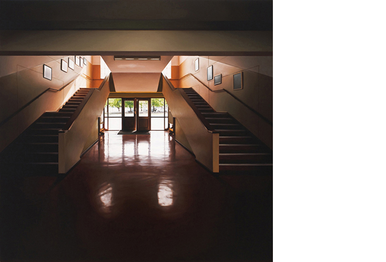
Thanks to It’s Nice That, I recently saw the work of photorealist painter Gina Heyer. People are pretty divided about photorealism; personally I’m a sucker for it, but not the show-off kind where it’s just a masterclass in transferring a photograph to canvas. Heyer’s work reminds me of Paul Winstanley‘s; the scenes are fictional with only a loose connection to reality. The skill is not the point. It’s all about the mood they create—often melancholy or slightly uncomfortable. The photorealism only heightens that mood, using familiarity to trick you.

Here‘s a selection of the work from her recent exhibition at Brundyn & Gonsalves gallery in Cape Town.

Read more

Geoff McFetridge

Art, Design, Illustration

No Comments


Share this post

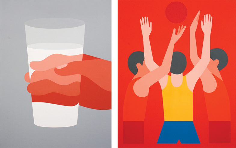
Not living in London any longer, I miss out regularly on good exhibitions like this; ‘Around us and between us’ is a solo show of new work by Geoff McFetridge (from September 14 to October 26 at Ivory & Black gallery in Soho). I’ve been a fan of McFetridge for a long time, but if you’re not familiar with his work, take a look at his website.

Do yourself a favour and go see it!

Read more