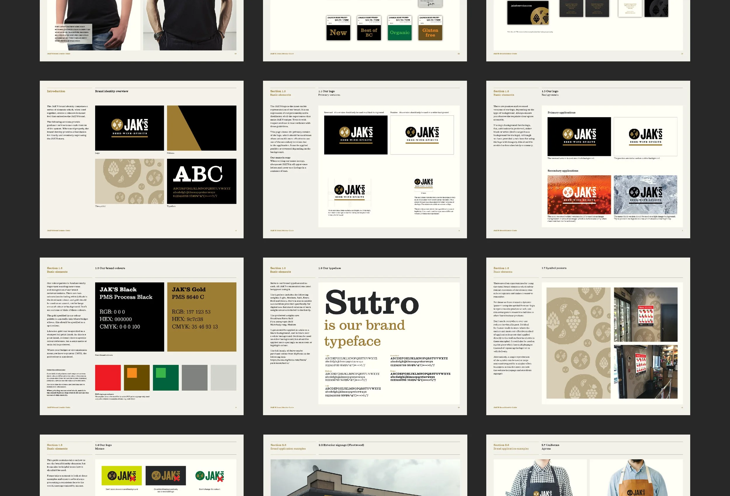
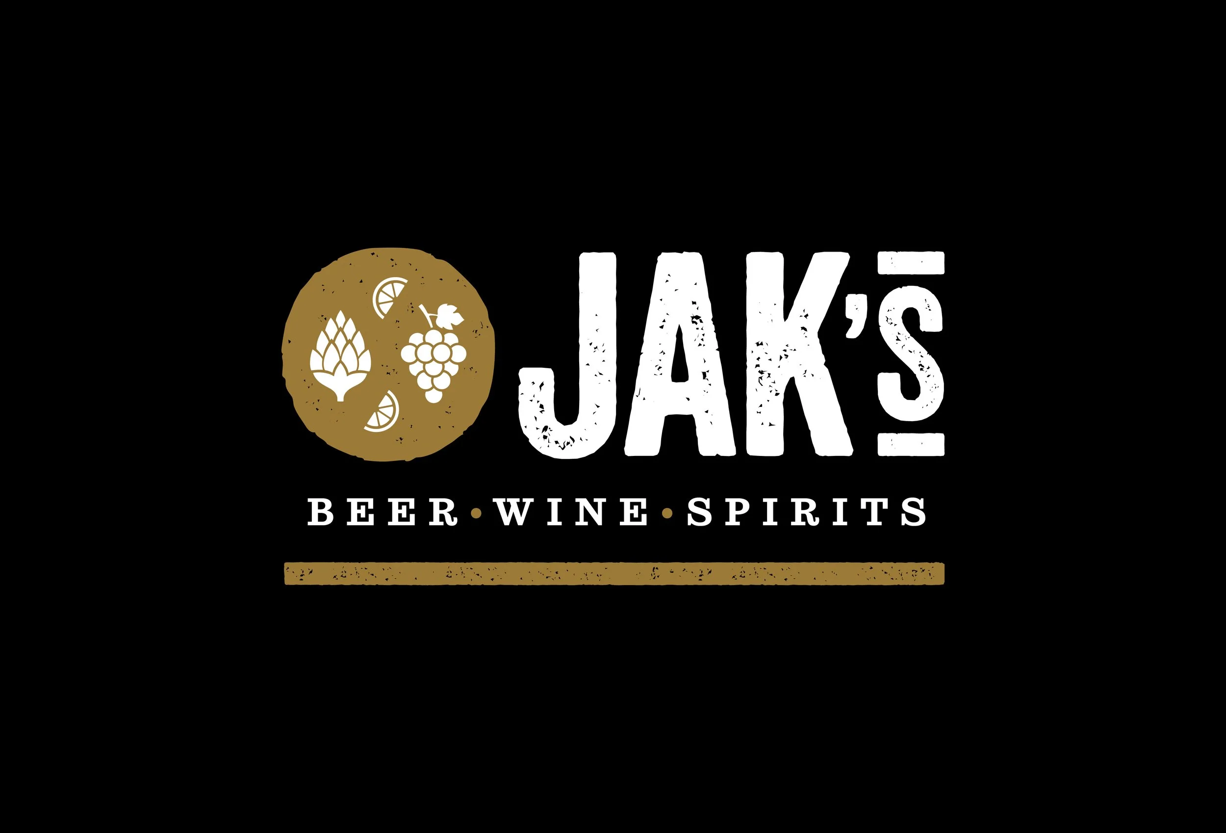
JAK’s rebrand
JAK Group owned eleven private liquor stores across Metro Vancouver and Penticton, but the stores had different names, identities and little to visually connect them. With deregulation reshaping the BC liquor market, the opportunity was to create a more cohesive and recognizable retail brand with more personality than the category’s functional convention. We reframed the name as JAK’s, making it feel less like an acronym and more like a fictional proprietor, while retaining a link to the founder.
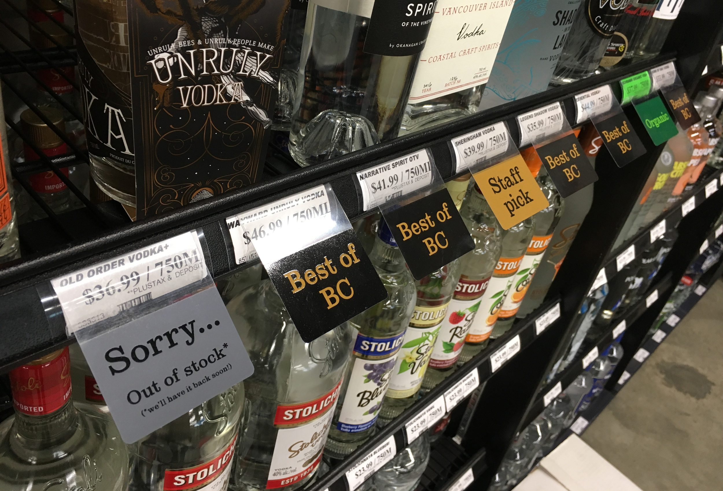
The refreshed identity kept the black and white palette, with gold added for dimension and a more premium feel. With no budget for full renovations, we implemented the brand store by store, creating signage, environmental graphics, mock-ups and store-wide implementation packages that could be handed-off to a sign vendor. The work improved navigation, created a visible sense of change and built a stronger exterior brand presence that connected seamlessly with the interior experience.