Established in 1998, Veris Gold Corp. is a growing mid-tier North American gold producer in the business of developing and operating gold mines in geo-politically stable jurisdictions. Until 2013, the company was called Yukon-Nevada Gold Corp. until the name change; this provided the opportunity to take a look at rebranding to reflect the meaning of the new name and also to provide a deeper visual identity system.
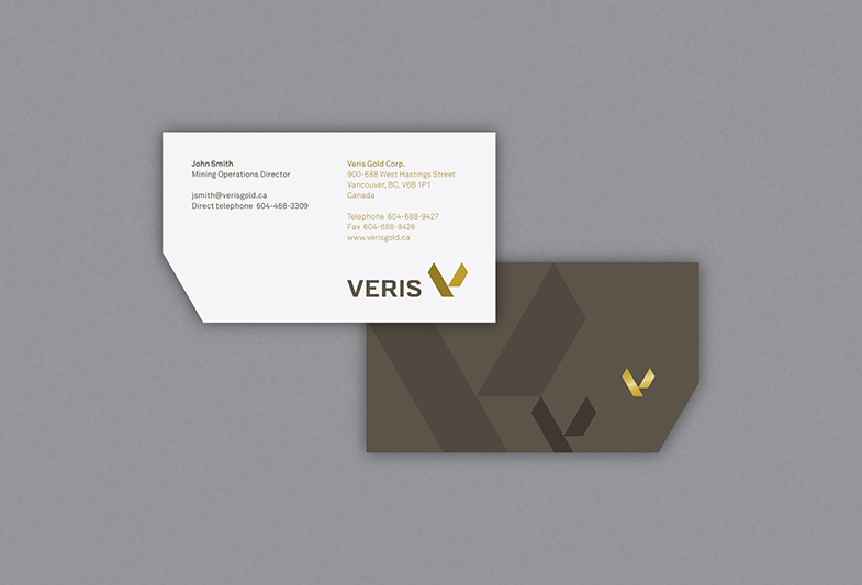
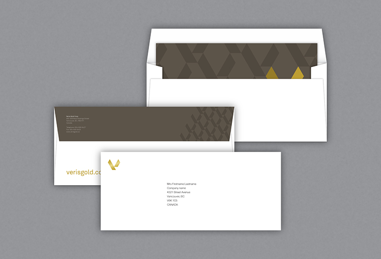
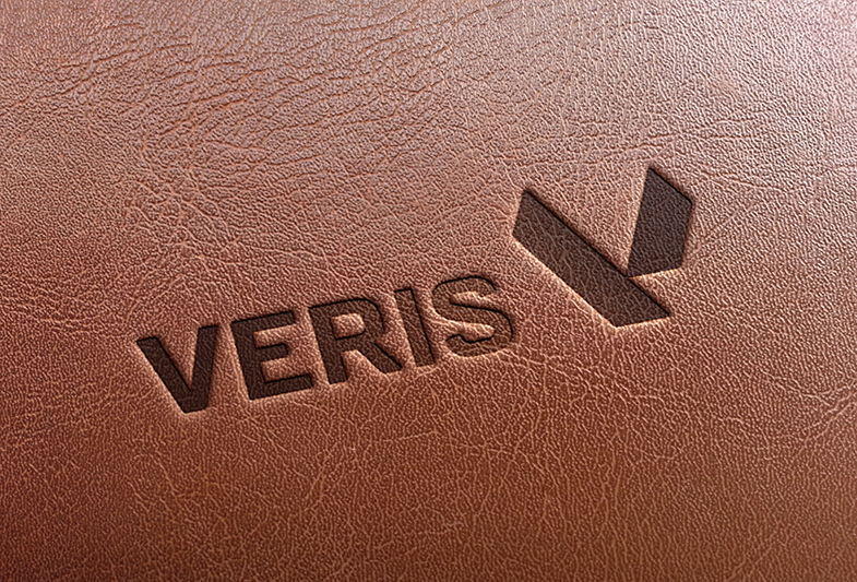
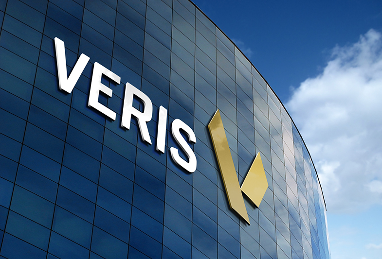
The identity plays on the concept behind the meaning of the name; Veris is a Latin word meaning ‘spring’ or ‘the production of spring’. As a symbol, the initial ‘V’ from ‘Veris’ naturally takes on the form of a positive, upward-moving spring. The abstracted letter is made from two graphic gold ingots. The colour palette relies primarily on a sophisticated deep bronze colour to enable small highlights and accents of gold to really stand-out.
(Work completed at Taxi West, Vancouver.)
