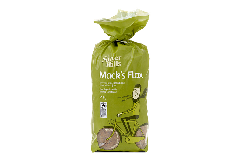
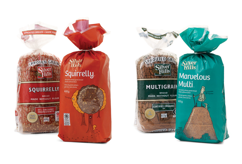
When Silver Hills first introduced its sprouted grain bread, it was a new and unique product on the market. Over time, competitors copied the process and they lost their differentiation. We were asked to revitalize their brand and identity, and design a package that would once again set the bakery apart. Additionally, Silver Hills wanted to change consumer perceptions about its products being a niche health food and broaden their appeal to an audience of families and individuals seeking a healthy diet without being too earnest.
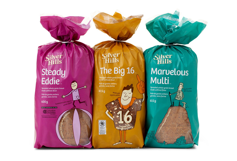
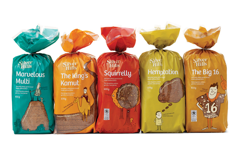
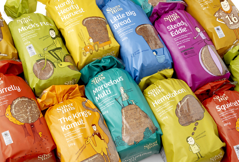
Leveraging the equity in Squirrelly, we developed a family of eclectic names for the breads that would be equally as memorable and establish the brand personality. Each variety features a whimsical illustration (by Robert Hanson), a bold colour palette and a product story that supported the simplicity and integrity of the Silver Hills brand. The biodegradeable bags were printed using matte inks, except where a bread window had been incorporated into the illustrations, allowing a unique view of the product inside.
In June 2009, the design was awarded a prestigious Cannes Lion at the Cannes International Advertising Festival.
(Work completed at DDB Canada.)