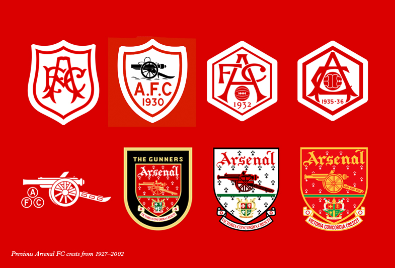
Founded in 1886, Arsenal Football Club is one of the oldest in world soccer. Like so many clubs with history like that, their club crest had originated in heraldic form, with strong connections to where they began (in Arsenal’s case, Woolwich in South East London, being the home of the Royal Arsenal munitions factory whose workers formed the first team). Over the next century, the crest changed frequently, often radically. The longest-surviving version was first introduced in 1949 and remained in use until 2002; a traditionally-inspired, but ultimately fake heraldic crest, it was a complex pastiche, which the club was unable to copyright. In the modern, heavily-commercialized game, this was not a good situation and the club had little control over its usage on merchandise.
Out of necessity, the club identified a bigger opportunity. Arsenal had always been run on strongly-founded, traditional principals, yet had always balanced this with innovation and forward-thinking. They were also on the verge embarking on a new era, marked by the move to a new 60,000-capacity stadium. From a strategic brand expression of ‘Forward, Rooted, Assured’ as our starting point, it was clear we couldn’t simply ‘clean-up’ the existing crest. We had to be more radical and fully apply the club’s forward-thinking philosophy.
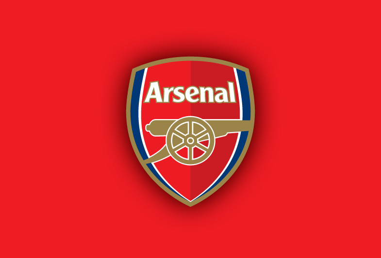
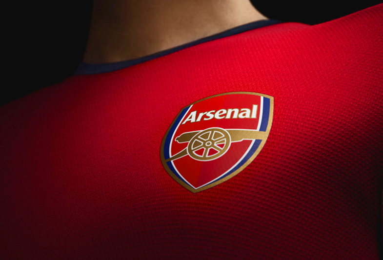
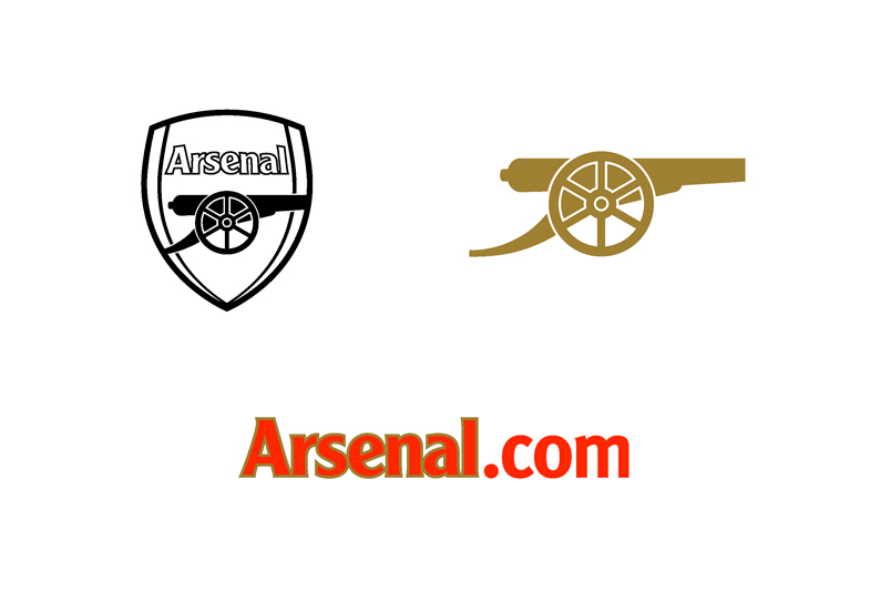
The solution took Arsenal FC into a new era, fitting for one of the biggest football clubs in the world. The solution eliminates the clutter of the past (and its faux-heraldic styling), retaining the critical elements of the cannon and shield with a wordmark contained within. The reductive simplification of the overall mark is a return to the approach taken with those used in the 1930s.
(Work completed at 20|20 Design & Strategy, London, UK.)