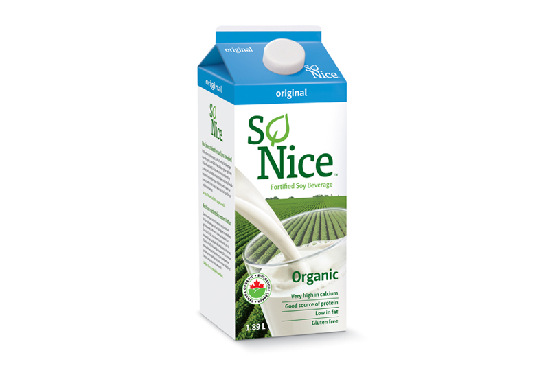
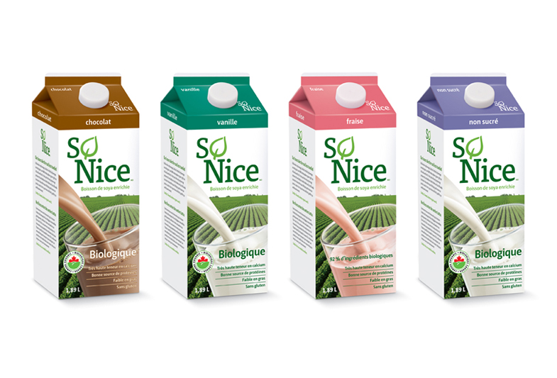
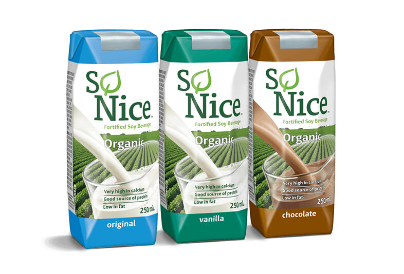
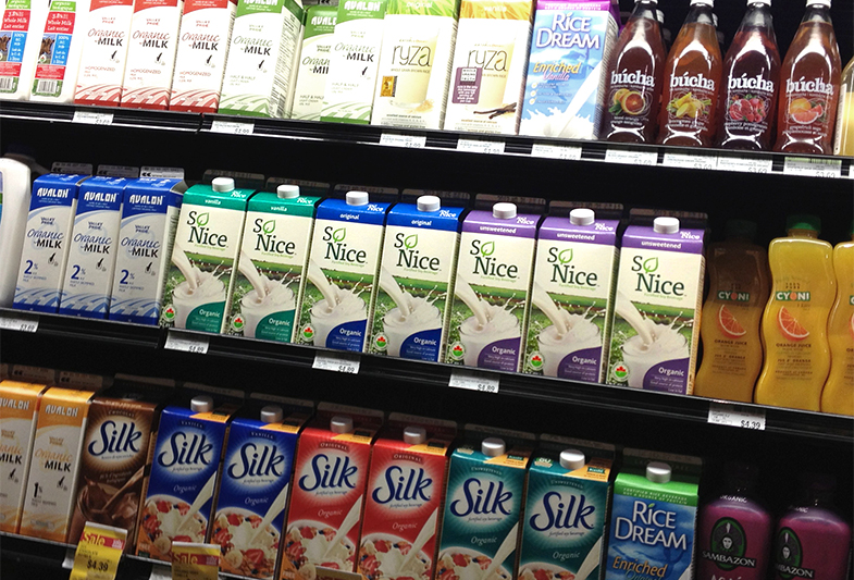
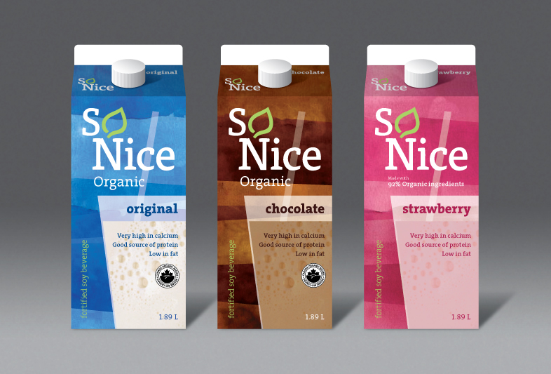
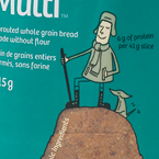
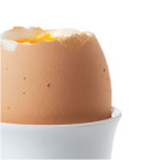
The packaging for So Nice soy beverage was out of step in a category where choice and competition was expanding, and a refresh was urgently required.
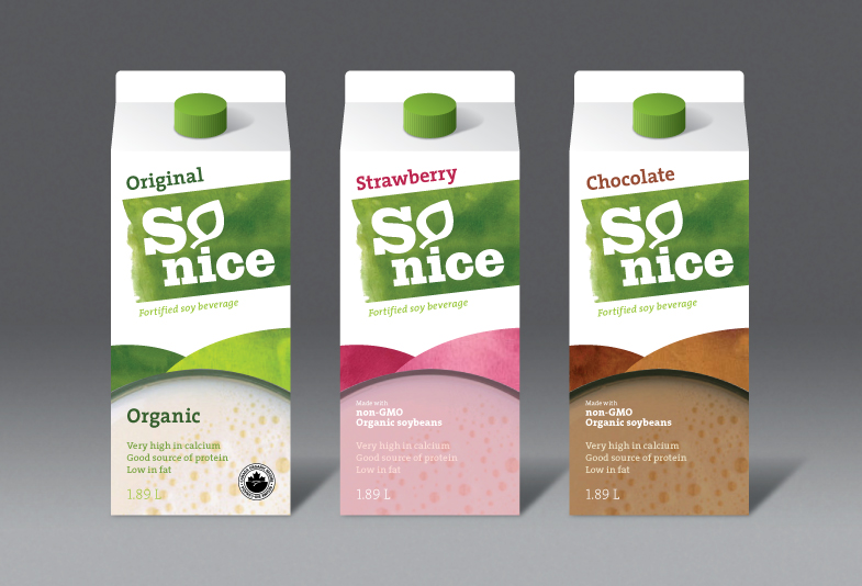
The final design strongly emphasizes the Organic values of So Nice, a crucial differentiator in the category, while not compromising taste appeal. The brand identity was updated to support the refreshed pack design and the messaging hierarchy simplified overall to give help consumers in their split-second shopping selection decision.
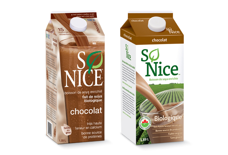
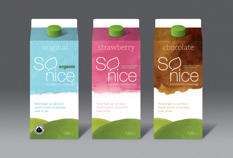
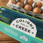
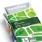
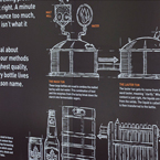
Also shown here are a number of rejected concept designs, showing a deeper exploration of the natural and Organic attributes of the product. Expressed with greater personality, emotion and graphic cues this was an attempt to provide even greater differentiation from the competition on shelf.
(Work completed at DDB Canada.)
