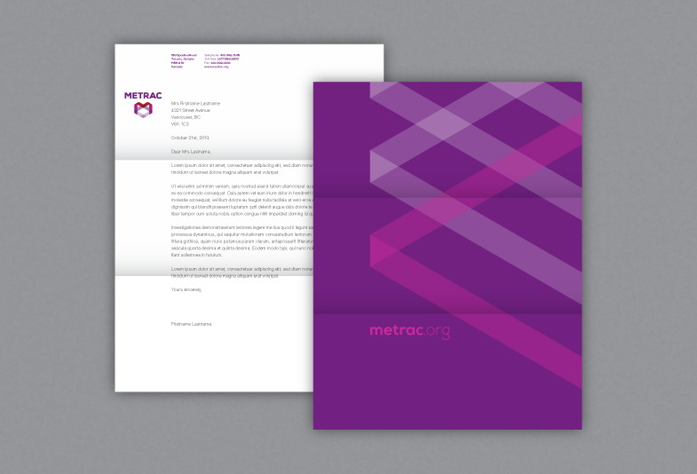
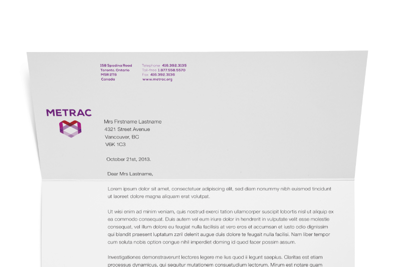
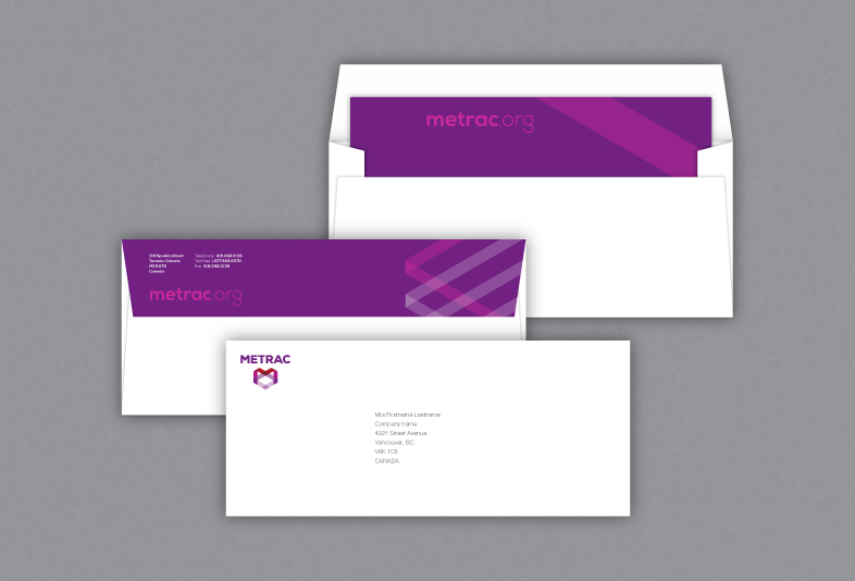
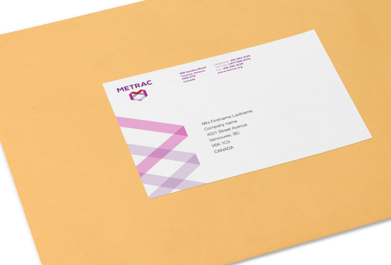
Formed in 1984, METRAC is a community-based, not-for-profit charity organization based in Toronto, Ontario, which works to prevent and eliminate violence against women and youth. In 2013, with the aid of funds from financial grant for marketing, they embarked on a process to refresh their brand. Although their message was clear and powerful, over time the visual presentation of it was indistinctive and muddled; the visual identity was dated and too masculine for the group they represented. A more sophisticated target audience and highly competitive fundraising landscape also necessitated a strengthening of visual
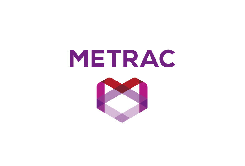
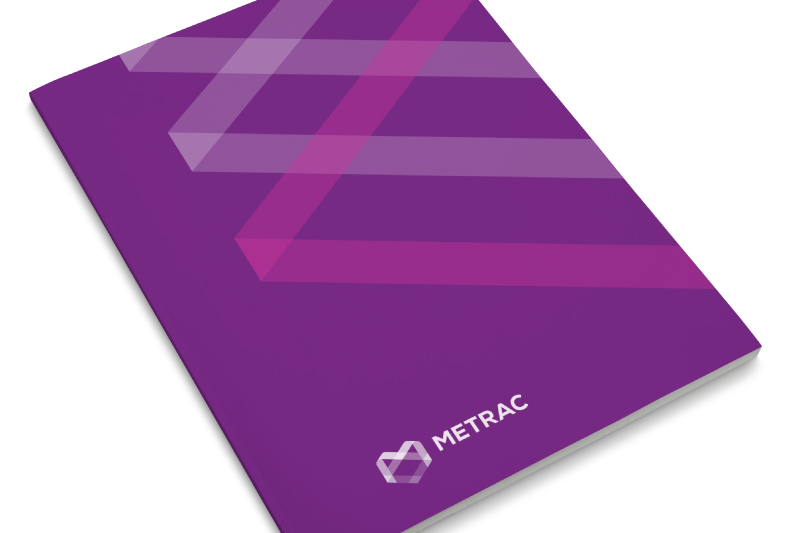
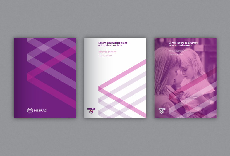
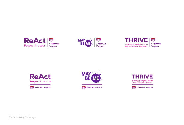
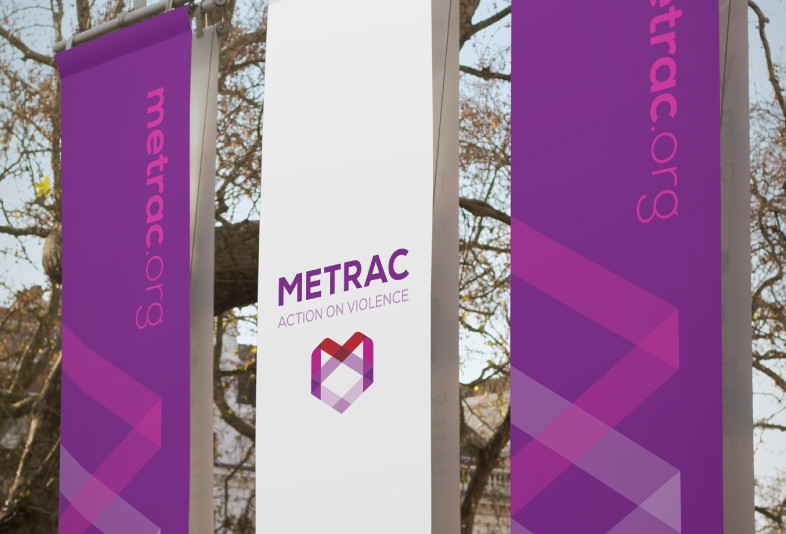
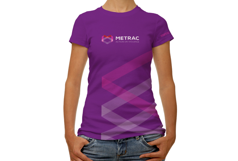
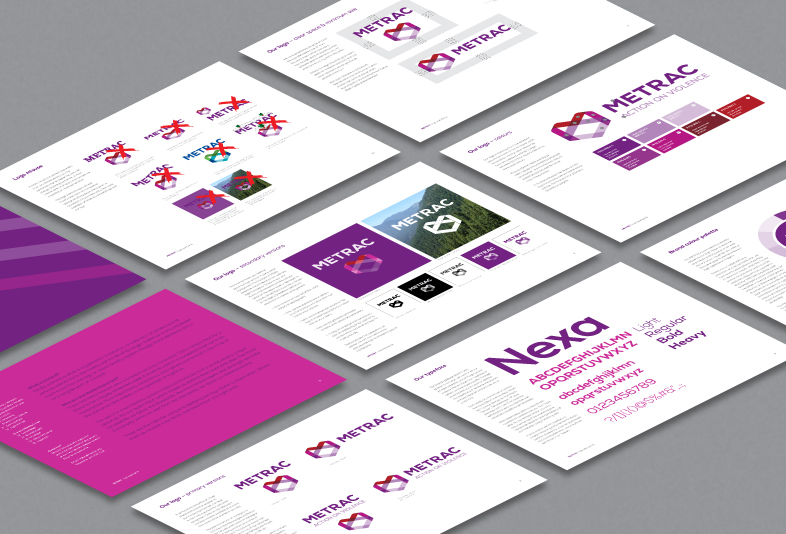
The new identity system takes the concept of safety and prevention to form a symbol from a ‘woven’, interlinked ribbon containing the ‘M’ of METRAC; we also consolidated and refreshed the colour palette to ensure METRAC could boldly express itself consistently and powerfully across all media. Ultimately, the new identity had to be approachable and convey a sense of warmth and welcoming which had lacked previously.
Also, METRAC uses an integrated, multi-disciplinary approach, working in partnership with individuals, community groups, governments, institutions, educators, urban planners and legal professionals; this is further embodied by the translucency and interlinked elements in the symbol.
(Project collaboration with Dot Dot Dash, Toronto.)
