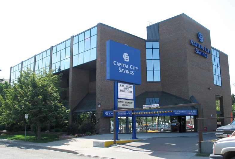
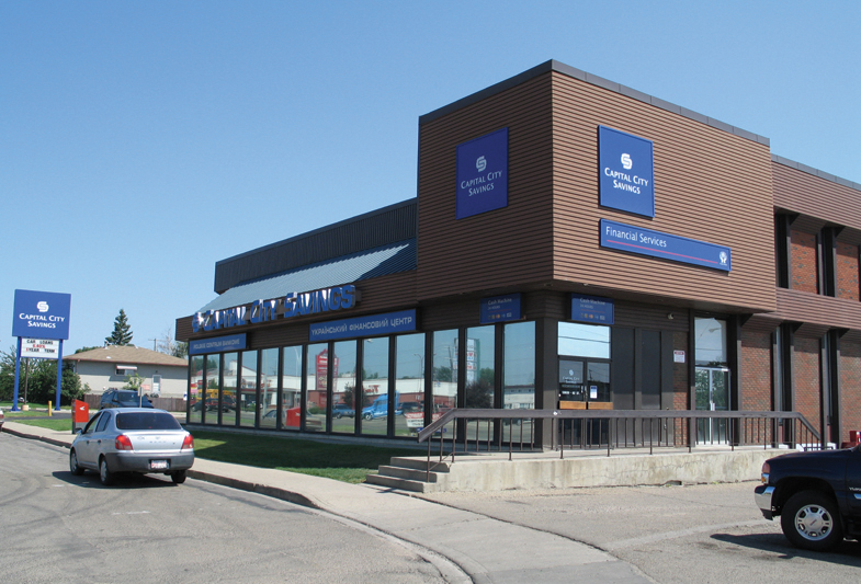
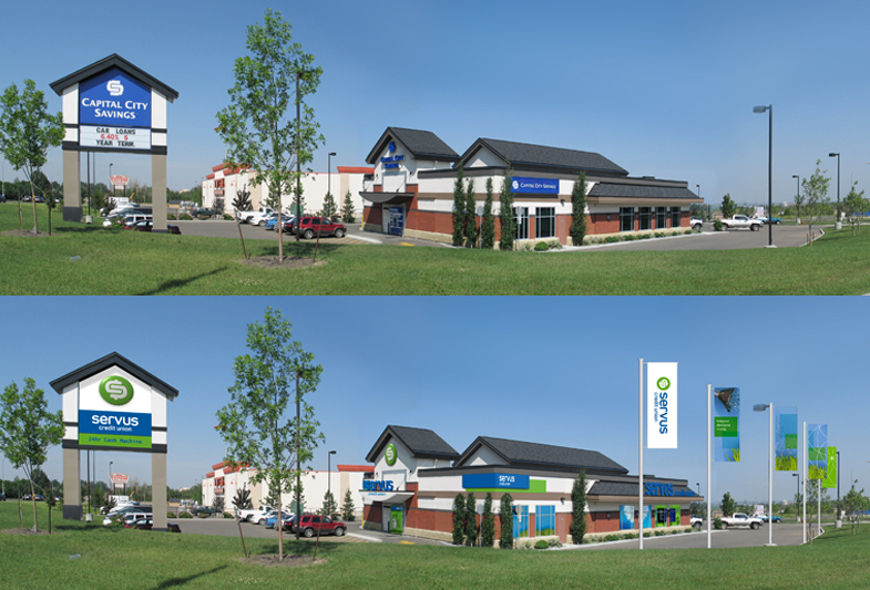
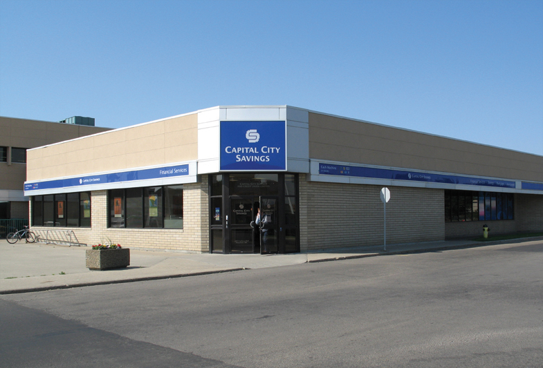
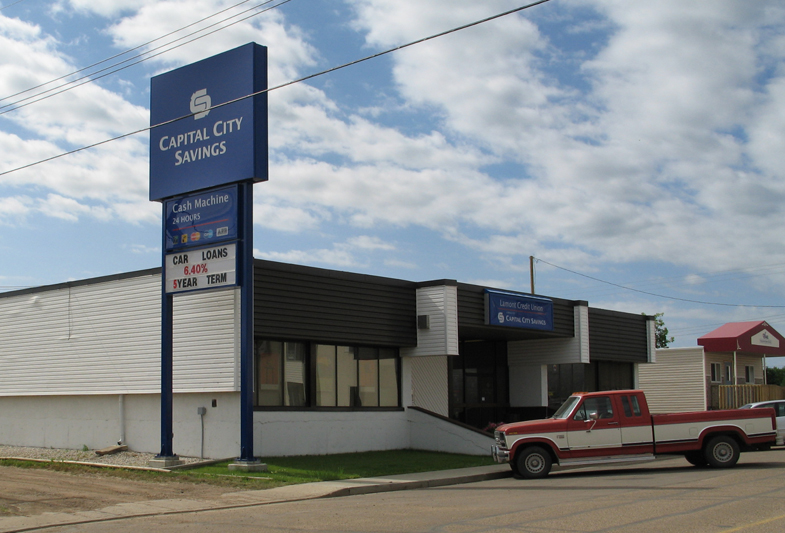
Capital City Savings was a member-owned financial institution providing full financial services to 181,000 member-owners from 50 service locations in 27 Alberta communities, making them the largest credit union in Alberta.
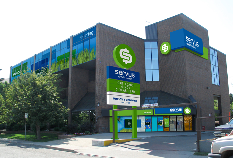
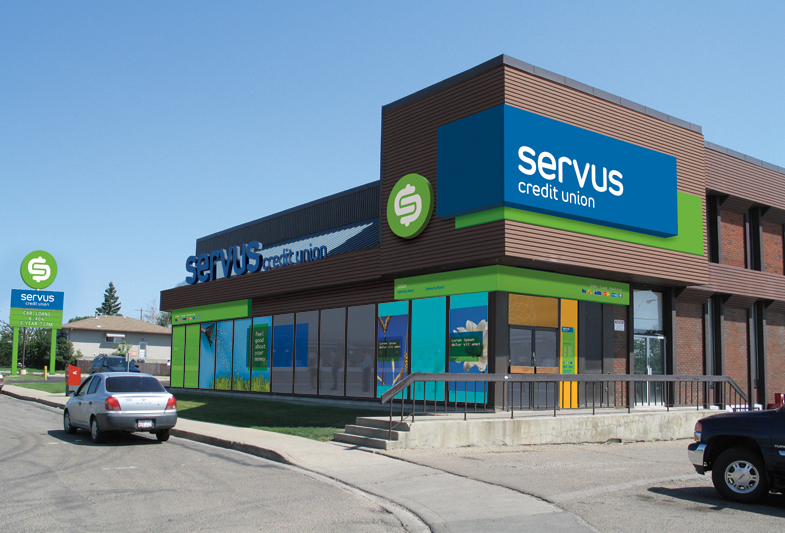
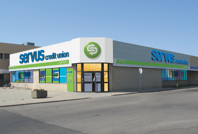
With the insights from strategic brand foundation sessions, a new identity under the name ‘Servus‘ was created that utilized the equity in their original; using softer lines and encased in a circle, the dollar-symbol acts as a beacon and a reminder of the core business. The new typography is contemporary and fresh and with its lower-case letters, allows the brand to be more approachable; a fresh new colour palette was also introduced, incorporating the green of the land and the blue of the sky, so abundantly visible in the prairies.
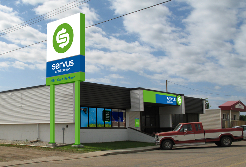
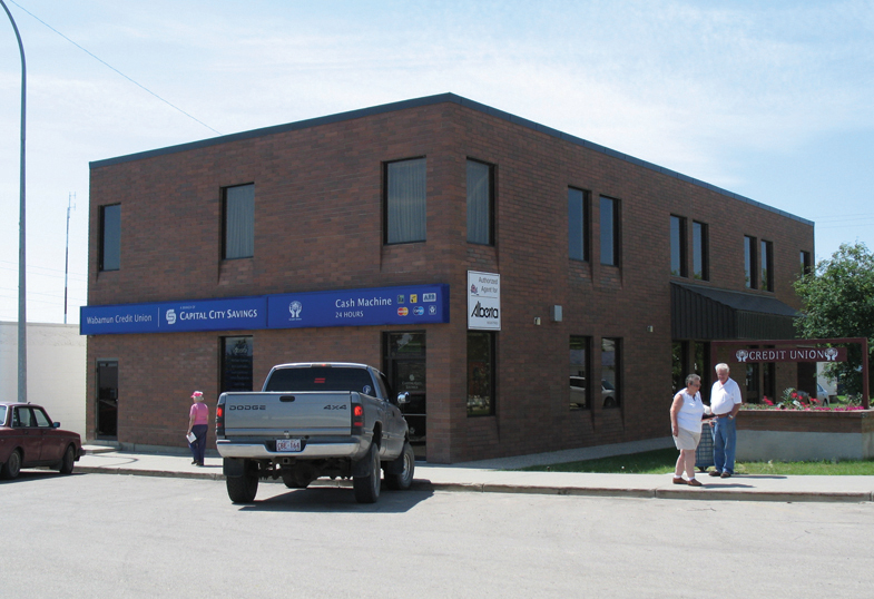
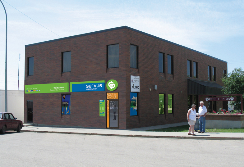
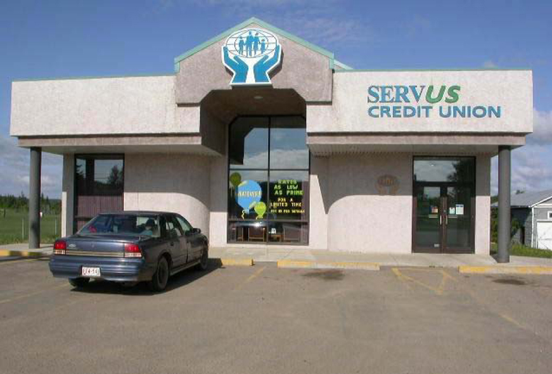
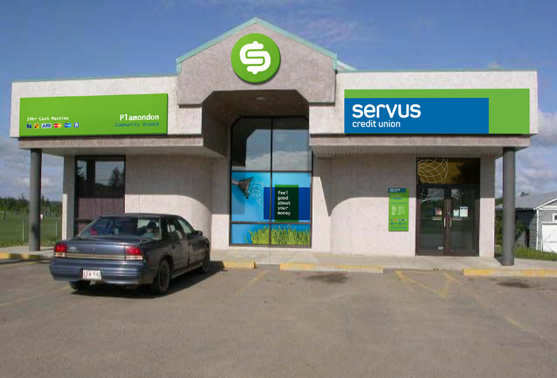
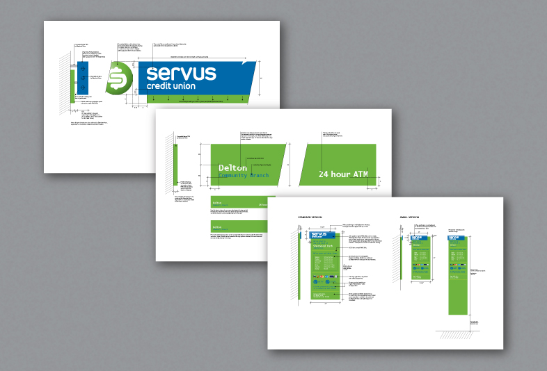
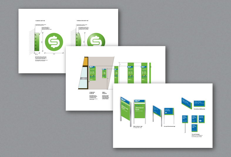
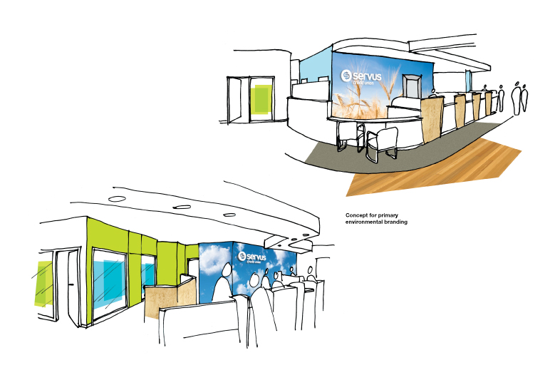
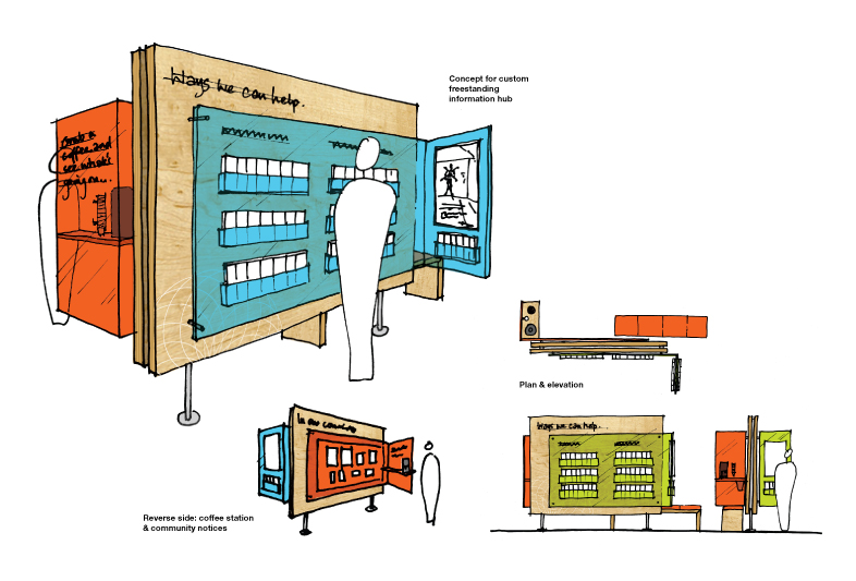
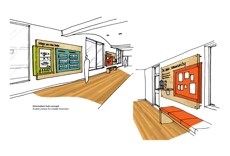
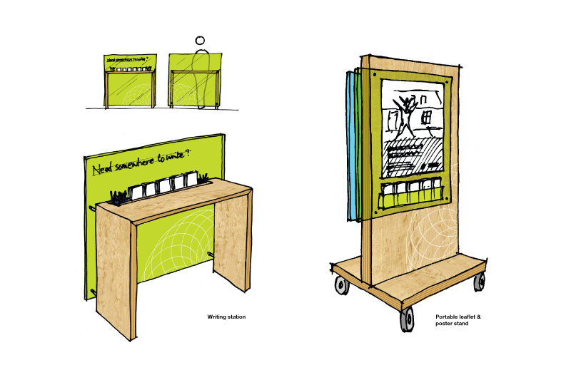
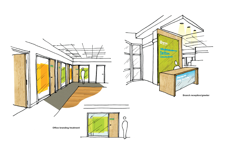
My task was to take the refreshed identity and bring it to life at branch locations—the primary consumer touchpoints—making it a tangible and engaging experience for members. This required the design of all environmental graphic elements of exterior and primary interior signage. The estate provided a number of challenges, with huge variations in architecture and different communication requirements relative to each location. I created a tiered system of enironmental brand elements tailored to a list of branches ranked by Servus.
(Work completed at DDB Canada, Vancouver.)
