BC Ferries needed to change people’s perceptions that they were an aging transport company just moving 22 million people from A to B each year, when in fact they are connecting coastal communities, helping them thrive and enabling people to live their coastal lifestyles. Of course, not forgetting the millions of tourists that travel on the ferries every year. The key insight was to create an experience that celebrated coastal life and gave a much needed sense of personality to travelling onboard.
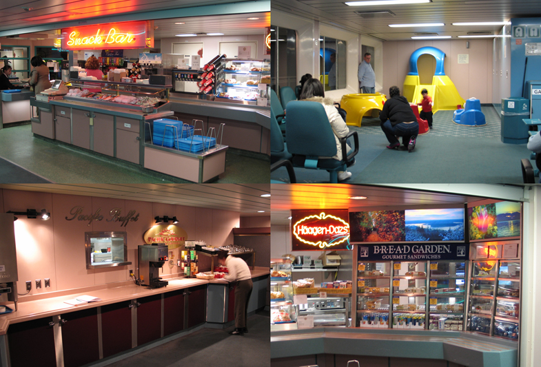
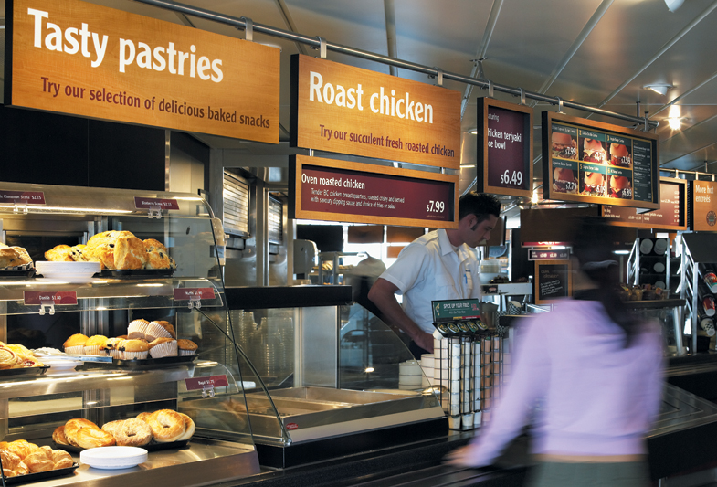
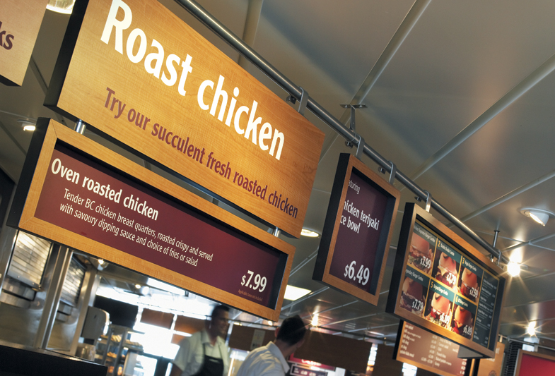
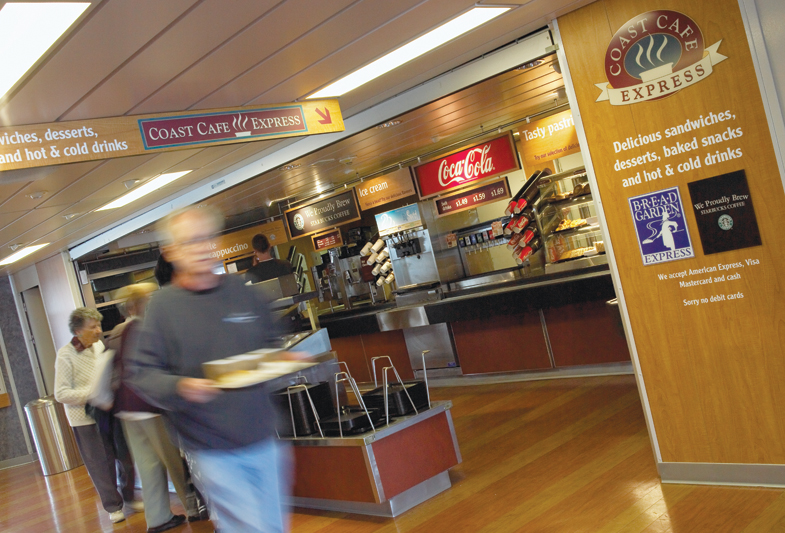
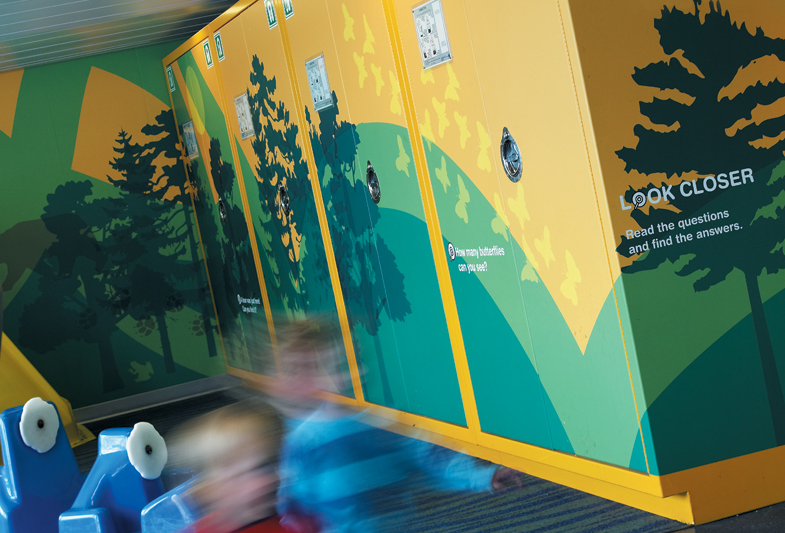
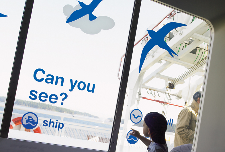
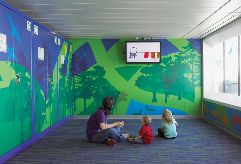
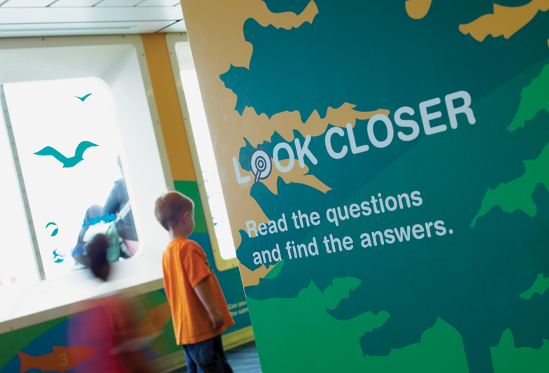
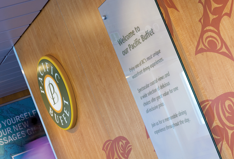
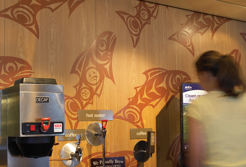
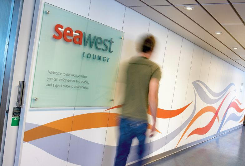
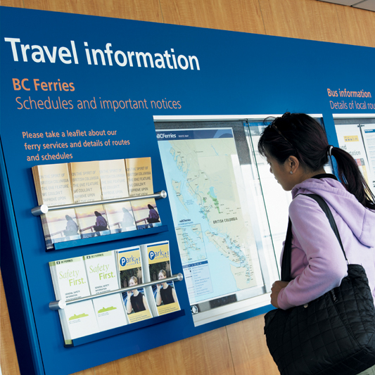
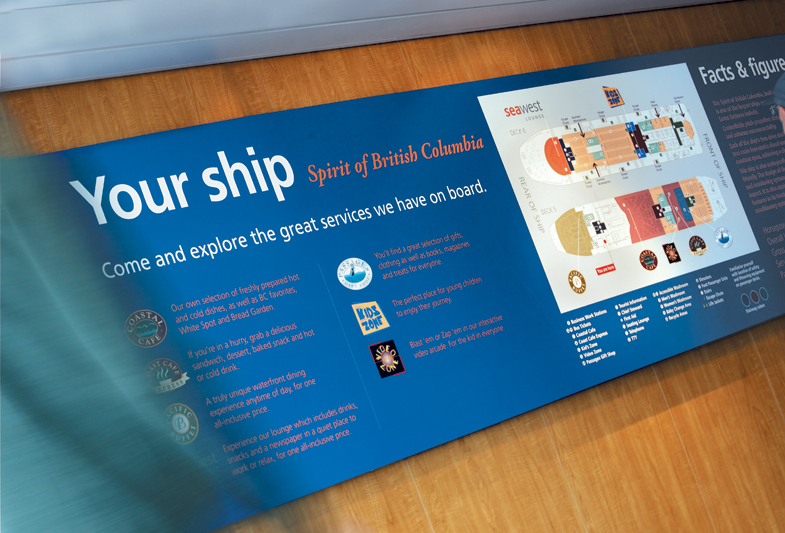
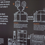
In this project, we were able to affect key areas of the largest ship in the fleet (at that time) to really bring the brand to life; the customer experience is critical so it was important to enhance it at these touchpoints in ways customers wouldn’t necessarily notice. Taking inspiration from people’s differing experiences, cultures and the natural beauty of the coast, we built a rich and powerful look for BC Ferries which sets out to unify all communications. The appeal of the various food offers has been greatly elevated and made more cohesive through the use of warm materials, more approachable signage and an inviting tone of voice. A new business lounge has also been developed along with a greatly improved customer information area. Specially commissioned artworks by Coast Salish artist Susan Point have been used at large scale as part of the environmental branding to serve as a beautiful and unique reminder of coastal culture and ‘Life on the Coast’.
(Work completed at DDB Canada.)
