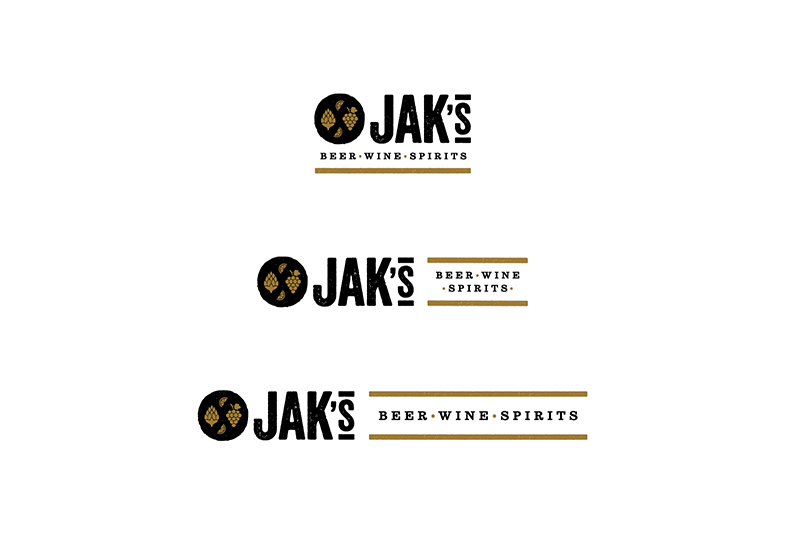
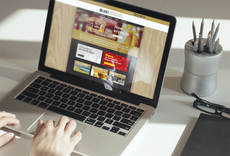
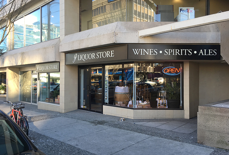
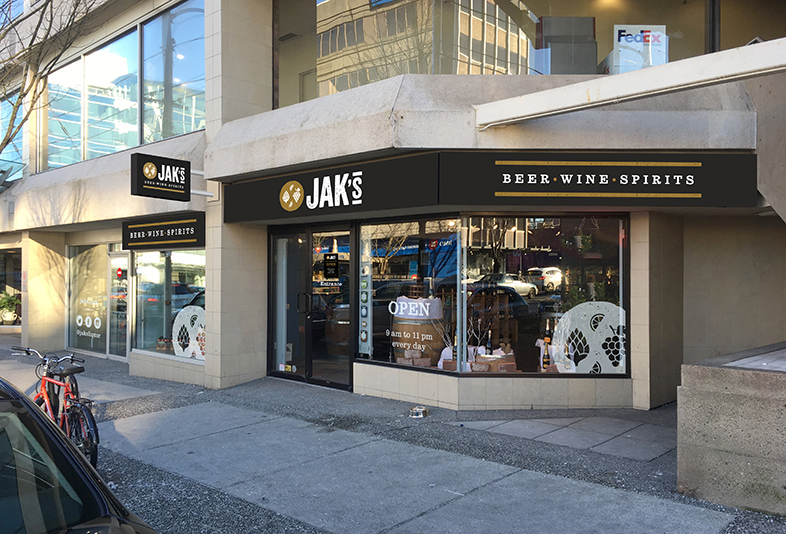
A chain of eleven private liquor stores around Metro Vancouver and Penticton—family-owned by the JAK Group—had a multitude of names and identities and nothing to visually link them together. The partners decided to embark on a rebranding process to bring cohesion to the disparate group of stores and elevate awareness in a market where deregulation meant the Government-owned retail was losing its monopoly.
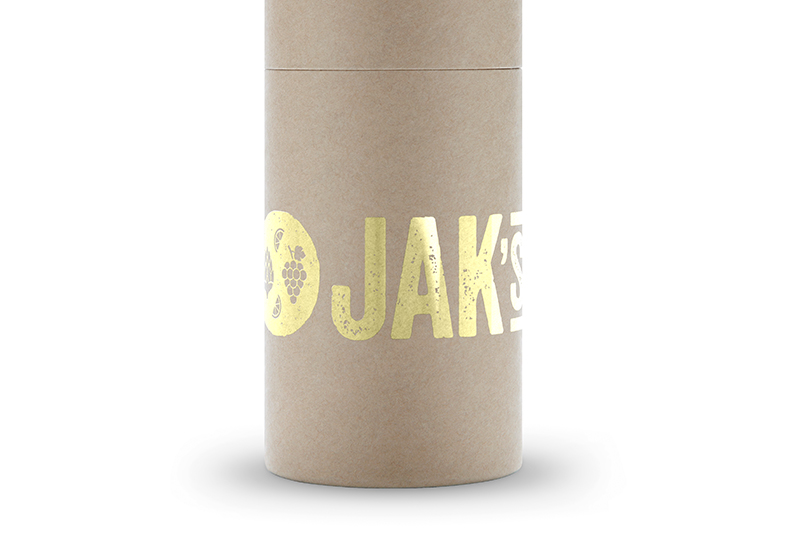
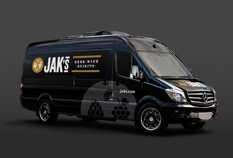
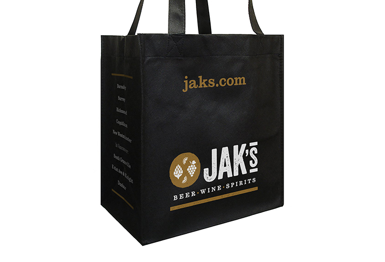
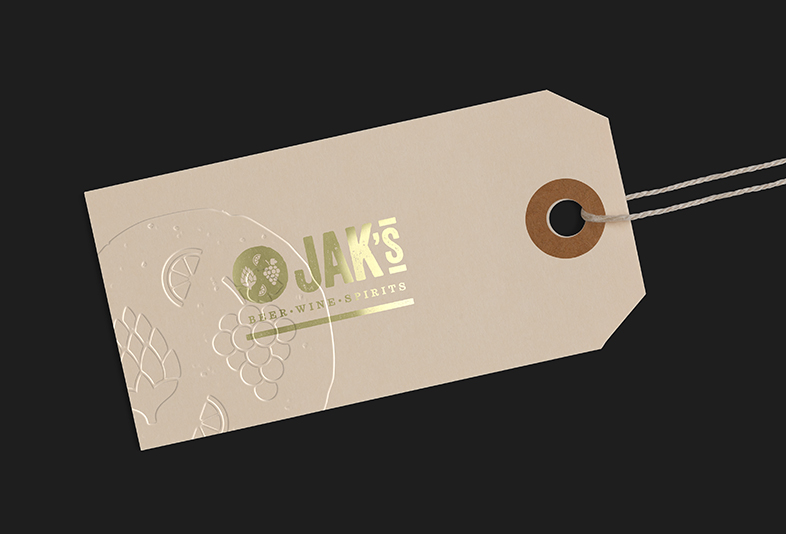
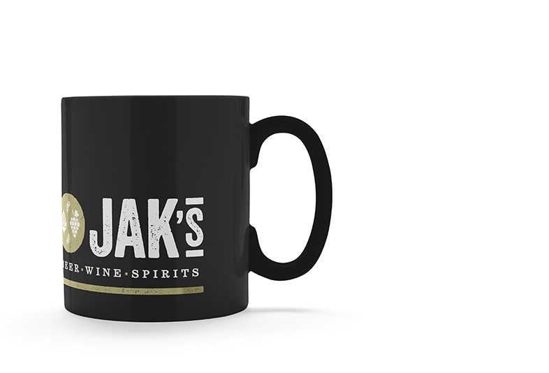
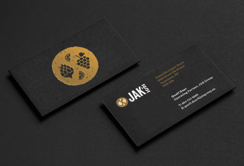
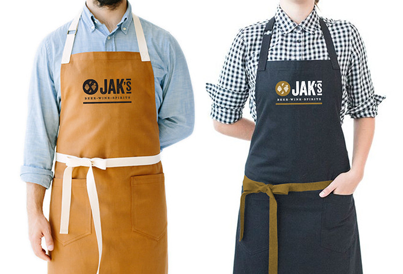
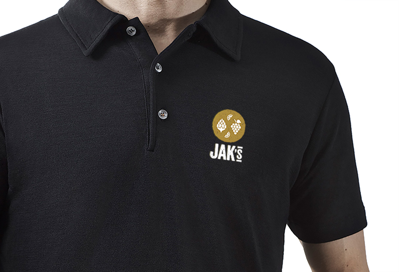
The group insisted on keeping the JAK name in some form, so our recommendation was to humanize it rather than employ it as an impersonal acronym with little meaning to customers. Thus, they simply became JAK’S. The spelling retains a historical link to the founder’s name, but it instantly became the fictional ‘proprietor’.
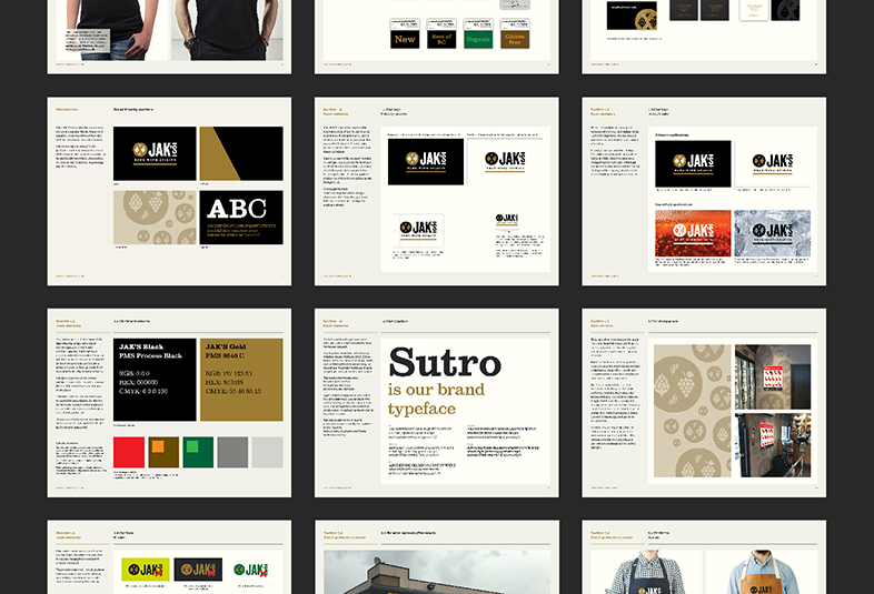
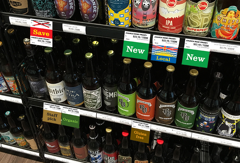
Consumers in this category are still getting used to anything different from the functional and unsophisticated government-operated stores in BC. There was an opportunity to rebrand with more visual personality and move away from the category’s utilitarian and functional convention. We created an identity which is softer and imbued with the longevity and heritage of the family’s time in business. We retained the black and white colour palette, but introduced a gold accent to add dimension and a premium feel. In addition to a new visual identity, we undertook implementation of signage and branding in the store environments.