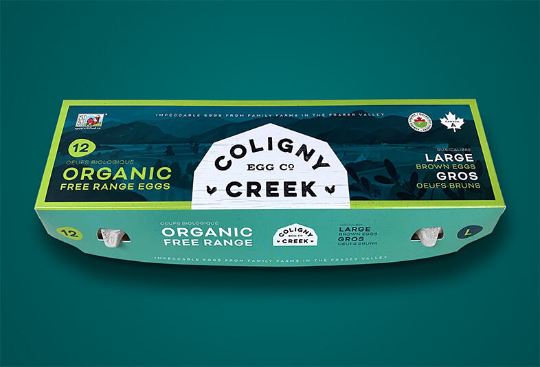
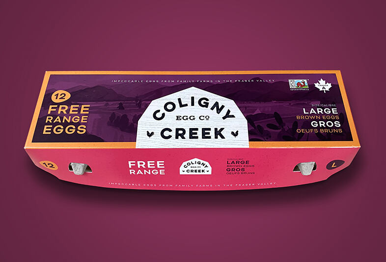
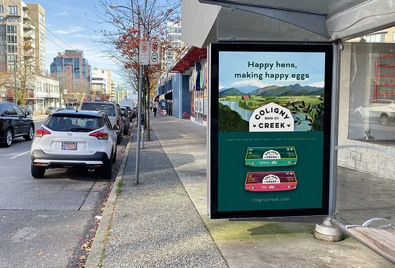
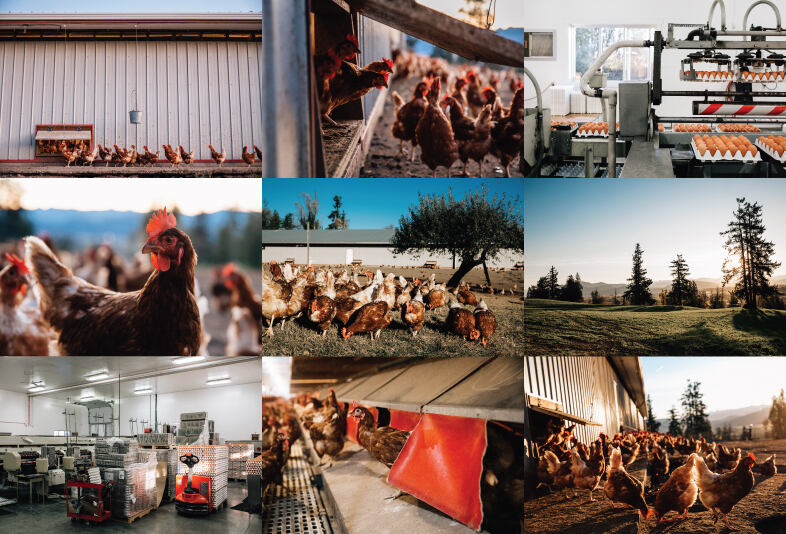
A small family of egg farmers from British Columbia’s Fraser Valley looked to me to create a new brand for their free range and organic product, following a restructuring of their business.
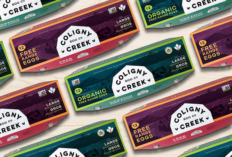
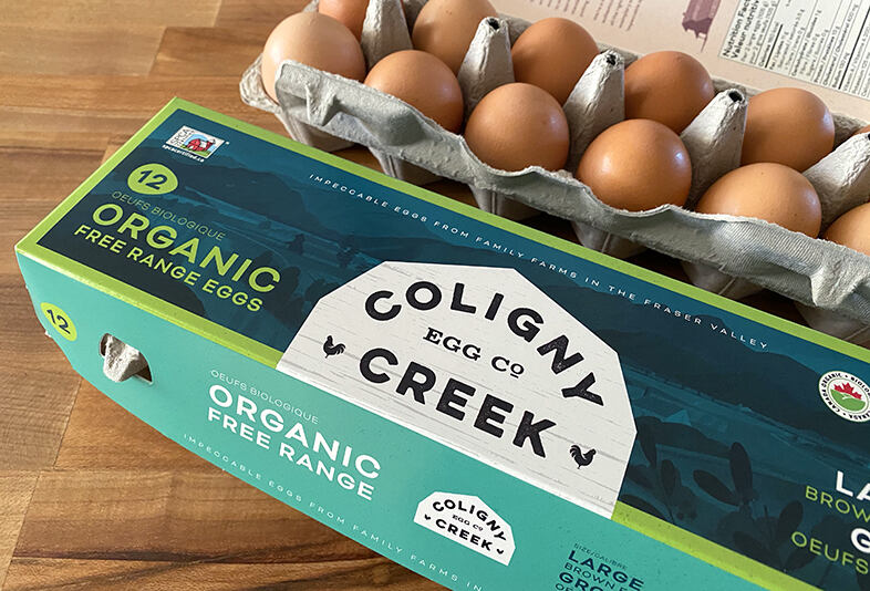
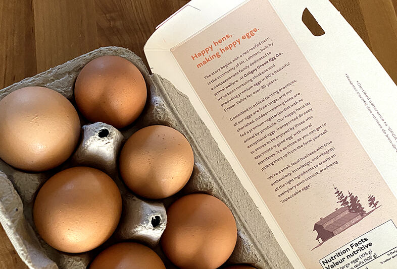
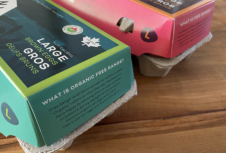
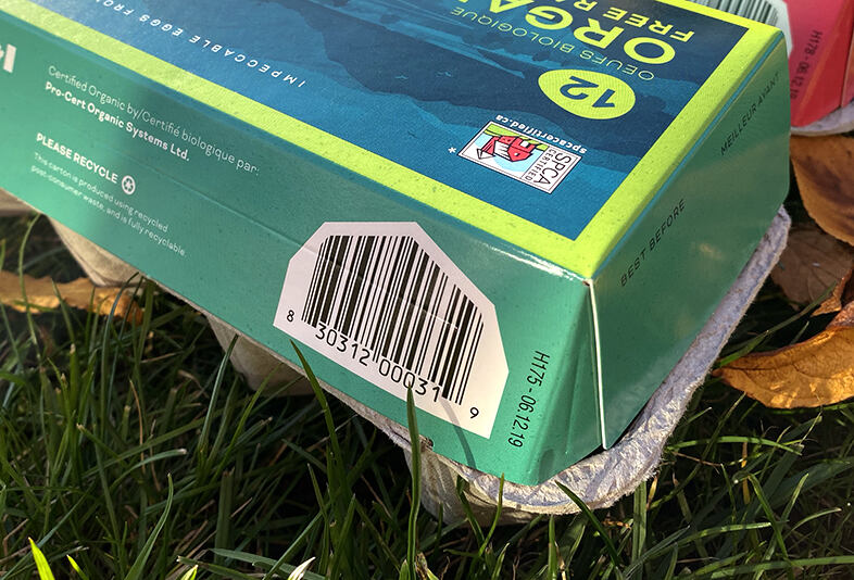
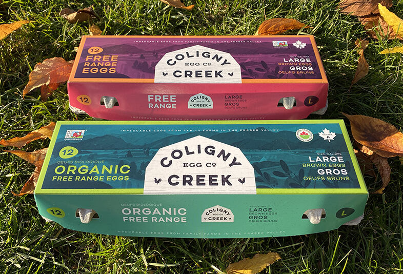
We provided category research, along with brand positioning, which informed work on tone of voice and creation of a name for the new brand. On recommendation, the client utilized an under-used full-colour egg carton format, for maximum impact on-shelf.
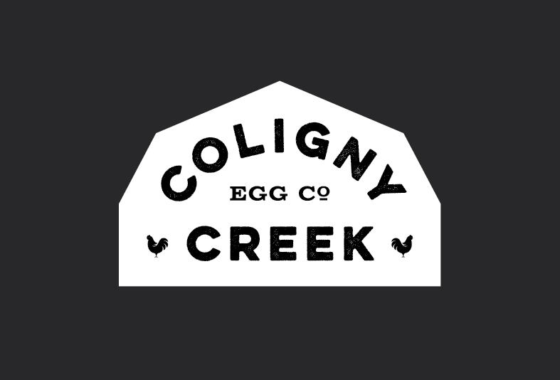
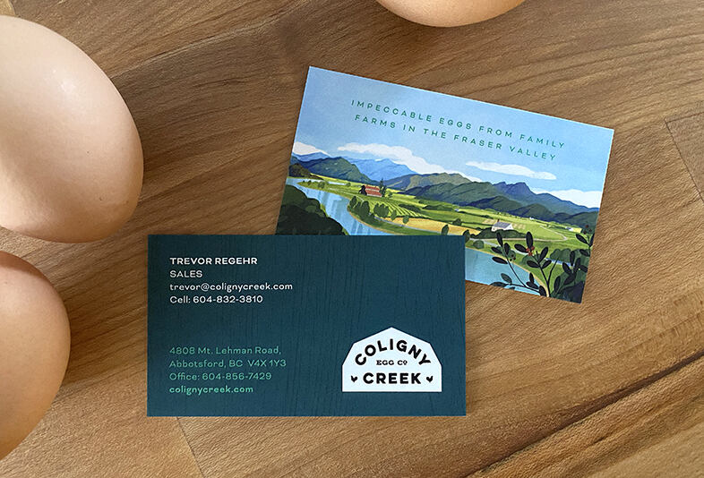
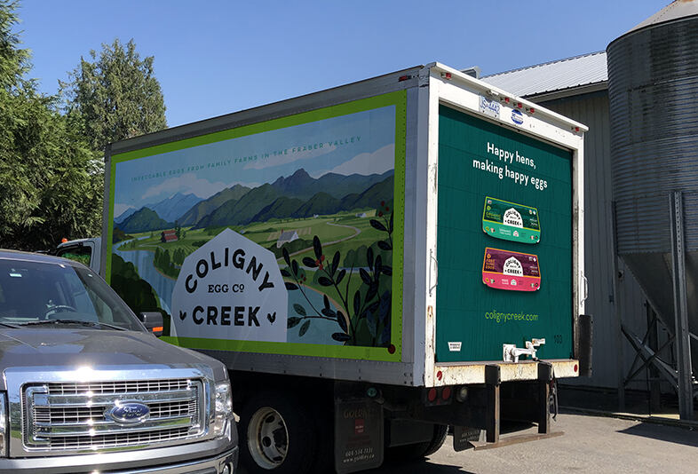
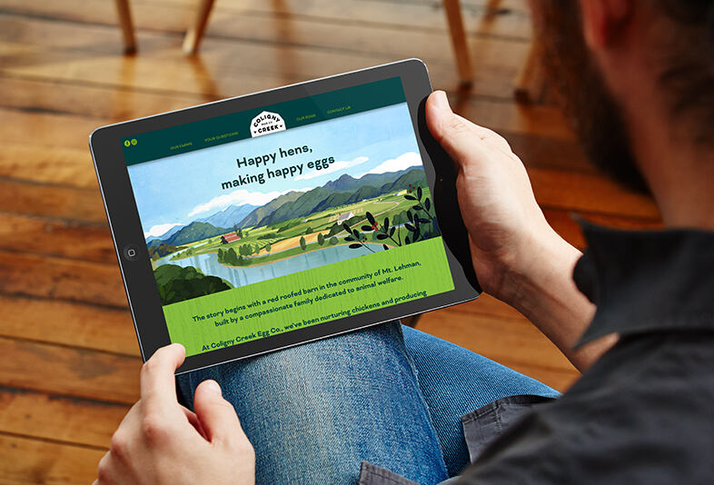
The illustration (by Jamey Christoph) depicts the region of British Columbia where the farm is located, featuring the family’s distinctive red-roofed barn. The identity riffs on the classic roofline of barns to provide a memorable and recognizable shape for the logo. Additional applications of the brand identity system included a website, truck graphics, business cards and photography art direction.
Copywriting and brand strategy collaborator: Jackie Bateman
