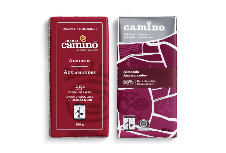
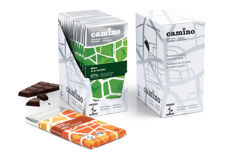
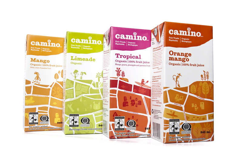
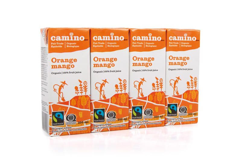
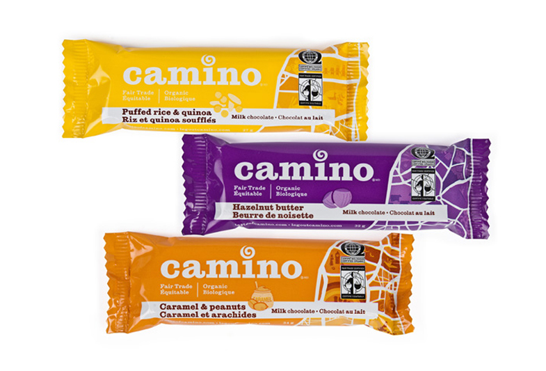
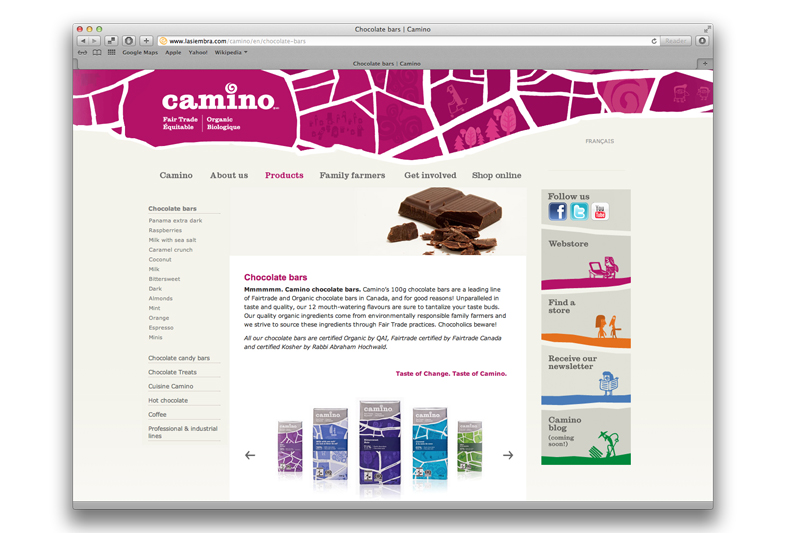
Cocoa Camino went looking to rebuild their brand so it appealed to a ‘mainstream’ consumer, and create a system that could stretch across other food categories beyond chocolate. Through research and a collaborative brand session, it quickly became apparent just how passionate the owners at La Siembra were about their mission of building sustainable, vibrant communities for their partner producers, their workers and families. Food, and the universal enjoyment of sharing and eating it, was their instrument to do this. This gave us the inspiration and focus for the creative development that followed.
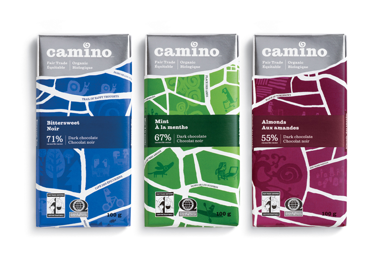
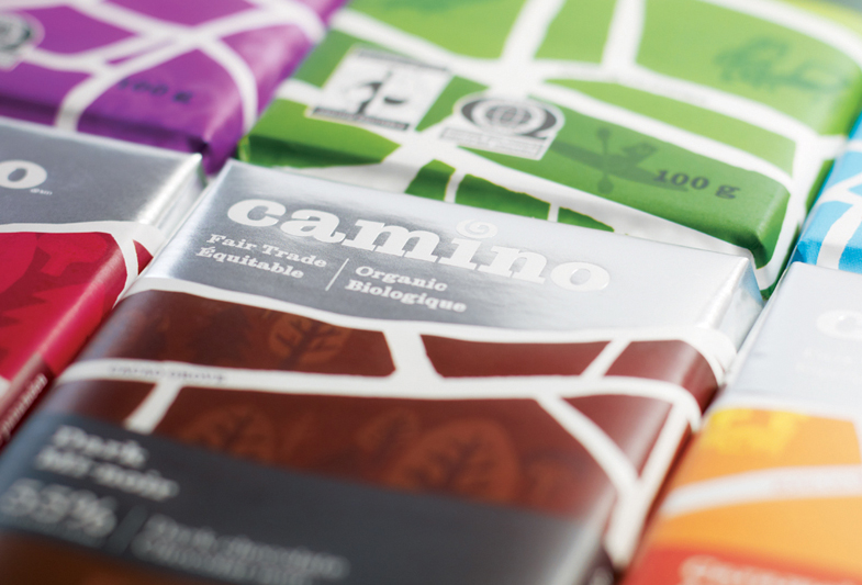
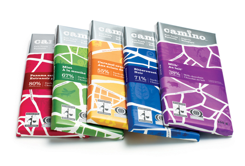
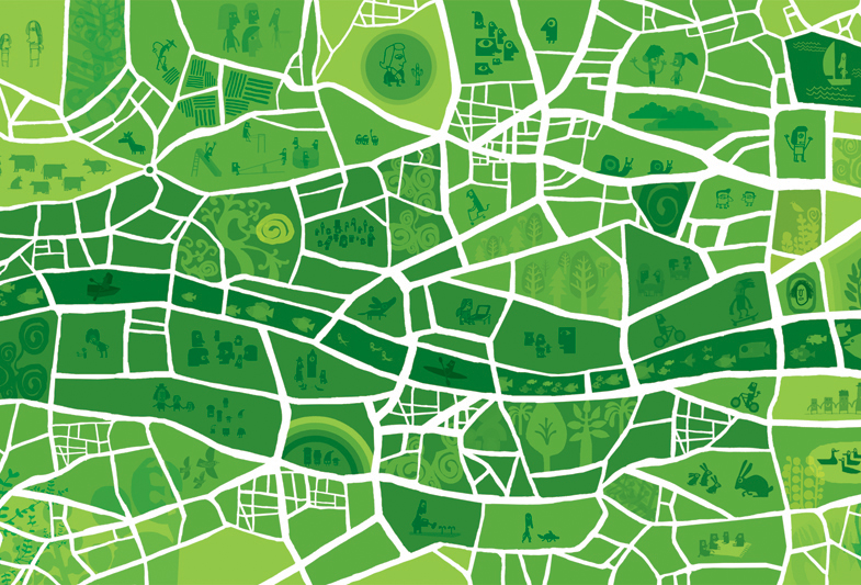
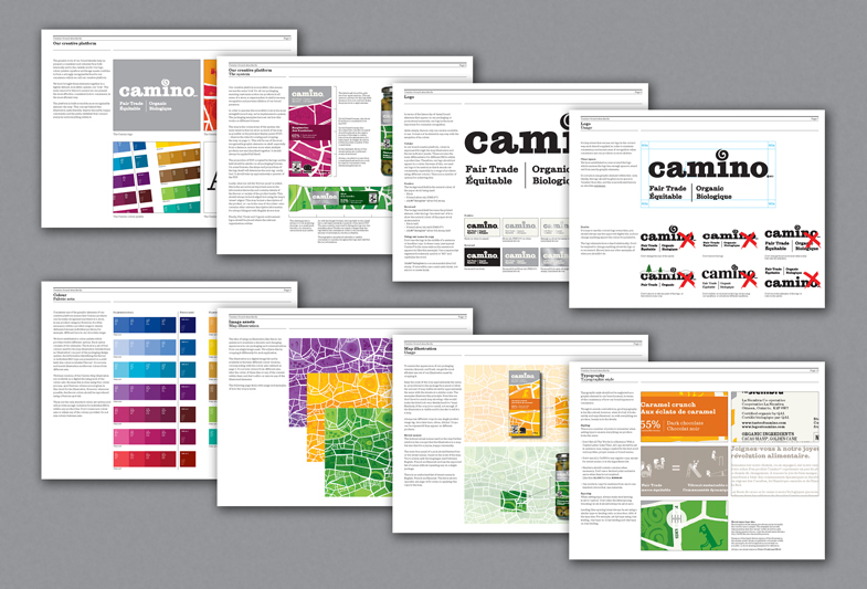
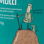
Core to the creative development and packaging design was a single brand idea; “the joyful food revolution”. A hand-drawn map (illustrated by Chris Haughton), representative of these joyful communities, reinforces the brand name; Camino is Spanish for “path”. A colourful palette differentiates the brand from the category norm of dark browns and blacks. The new look launched late in 2010 and was well received by both the trade and consumers alike; in the first year, revenues increased by 26% in the face of a tough economic climate.
(Work completed at DDB Canada.)
